Tuesday, December 16, 2014

Alternative movie posters and Breaking Bad

Movie posters don't have the impact they once had. Many moons ago, even if the TV commercial for the movie ("the trailer") didn't get your attention, you couldn't help but notice the upcoming attractions displayed in front of your local cinema. Of course, now, people don't walk past local cinemas much anymore. Not many walkers or cinemas, I guess. Too bad, because the movie poster (or the one-sheet) was often a fantastic work of commercial art, teasing the plot of the film while showcasing the stars and theme of the story. Everyone has seen this, right?


Now, the one-sheet has been displaced in our collective memory by the viral on-line trailer (sure, maybe the TV spot too). However, there is a healthy subculture of collectors scooping up these posters, either in original form (expensive!) or as reprints. Modern art, I say!

There is also a sub-subculture of collectors always on the lookout for European/Asian versions, such as this:

Yes, that's Jaws too. Google your favorite movie and add Poland or other eastern European country as a modifier. You'll see some incredibly inventive and bizarre graphics, forever changing your perception of the film in question. Here is just a sample...


Very cool stuff...
---

If you dig the non-US version of these posters, there are some very creative folks putting out alternative English-language one-sheeters too. Matthew Chojnacki's book, aptly titled Alternative Movie Posters: Film Art from the Underground, is available now. Click over to Michael's site for some samples, and buy his book!


---

Check this out - I love the simplicity of these retro/paperback alternative posters at this Flickr site.

---

For those of you that enjoyed Breaking Bad (which I think includes everyone I know), this poster is a great gift idea:
See it in a larger format and buy it direct from Dennis Culver right here!


More cool graphics and illustrations coming your way next week!

Other news'n'notes
Pulpwear is one of a handful of blogs all written by me, Mike Thompson. I love finding the coolest stuff on the web and delivering it to you semi-regularly via the Zombie Cat Bacon Universe of Blogs. Now with Zombie Cat Bacon's new daily publication, The Daily R'n'R, you can find most of the fun stuff in one place - comics, handcrafted snacks and soda, craft whiskey, great recipes with a BBQ theme, and the most interesting news from the worlds of movies, TV and sports. Visit the Daily R'n'R today and register for the Daily R'n'R email newsletter delivered every day at lunchtime - always free, never boring.


Wednesday, November 26, 2014

Happy Thanksgiving! Here's some neato art things...

So many fun things in my Pocket I'd like to share with everyone...here's a few...

If you're ever looking for a concise graphic overview of art in the 20th Century, you can't go wrong with this "artmap" by Rama Hoetzlein.


See it in a larger size here at the artists site

He cleverly includes media, politics and science to provide even more context of each movement. Wander around his site for a while - cool stuff to behold...

---

Next up, we have an array of vintage magician posters from Rebecca O'Connell at Mental Floss. Now, who doesn't love a magician? Me, for one. But the classic style of these advertisements have a strong pulp sensibility and you can see the influence they had on early comic book covers as well.


---

Guillaume Cornet - his intricate and geometric illustrations are just fun to stare at for while:
There's a bunch more here

---

Everyone has seen this before, correct? Norman Rockwell's Freedom From Want:


Since Thanksgiving is tomorrow, how would you like to see about three dozen parodies of the above image? I know I would, so let's click here and enjoy, courtesy of Philip Van der Vossen at Gunaxin.

Here's one more:


Have a great long weekend and travel safe!


Thursday, October 2, 2014

Autism and art, plus a little motivation

I recently came across the story of Iris Grace, an Autistic 5 year old who possesses an amazing ability with a paint brush.  Autism affects one of every 68 children in the US, according to the CDC. Currently she has over 95,000 followers on Facebook and has sold paintings to private art collectors all over the world.


"All profits from the sales of her art go towards art materials and her on-going private therapists". I strongly recommend visiting IrisGracePainting.com and watch her at work.

Beautiful stuff...

Here's a few more links in the same vein:
http://50watts.com/Drawing-Autism
https://www.facebook.com/ArtistsandAutism
http://discovermagazine.com/galleries/zen-photo/a/autismart

______________________________

Not feeling like working today? Lack of get-up-and-go? No spring in your step? Let Bill Jones help with these motivational posters from the 1920's and 1930's:


More about Bill Jones can be found at the Norman Rockwell Museum website

Wednesday, September 24, 2014

The Big Four

I'm not gonna turn this post into a knock-off Wiki page about pulp magazines. I just want to feature some of the covers of these mostly-forgotten periodicals.

Here's four covers per member of the "Big Four" - Argosy, Adventure, Blue Book and Short Stories. Why the "Big Four"? The most prominent keeper of the pulp flame, Ed Hulse, says so, that's why.

Pulps have far more influence than you might realize, and featured some of the finest writers of the 20th century: Edgar Rice Burroughs, Ray Bradbury, Louis L’Amour, Dashiell Hammett, and Raymond Chandler to name but a few. If you were looking for jungle adventures, zombie stories, spy thrillers, and steamy romance, the pulps had it all and more. While most of the titles and writers have been forgotten, the themes and story telling devices live on to this day in comics, TV and movies.

And the covers...wow!

ARGOSY


ADVENTURE


BLUE BOOK


SHORT STORIES


Watch for these amazing covers and much more at the Pulpwear shop!

Tuesday, September 9, 2014

Fruit Crate Label Art - anonymous, disposable masterpieces

Wanna see something cool?


First an explanation. Take it away, CollectorsWeekly.com:
First appearing in the United States during the 1880s, paper crate labels were designed to draw attention to produce boxes and make them stand out at public markets. By the 1950s, though, pre-printed cardboard boxes had replaced the use of paper labels on wooden packaging, so discarded and unused crate labels became collector’s items.
Thanks to the expansion of the U.S. rail network during the late 1800s, growers were suddenly able to ship produce from one coast to the other. Labels helped identify a box’s contents, company name, and source location while this produce was en route. Primarily affixed to the ends of wooden boxes containing fresh fruits and vegetables, crate labels were also an early form of company branding and advertising, featuring full-color lithographed imagery with clever slogans and logos.
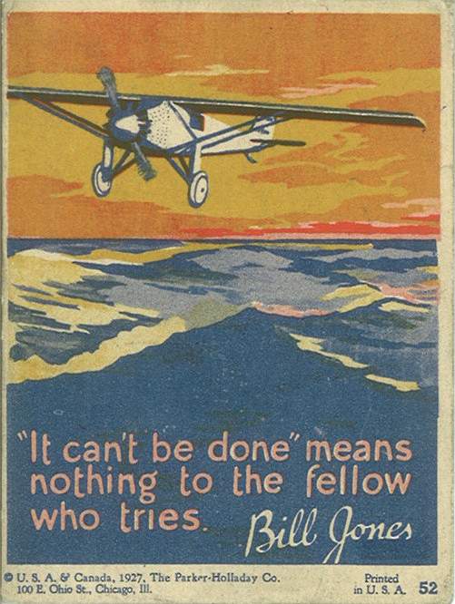
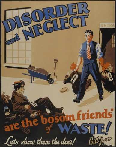
By the first half of the 20th century, the retail function of crate labels was firmly established. Most markets and grocery stores displayed produce in the same wooden crates in which it was delivered, so colorful labels became a great way for growers to differentiate their products from competitors and catch a shopper's eye. Labels emblazoned with tropical flowers, boats, and bathing beauties adorned produce boxes in markets across the country. Common brand names like “Snow Owl Apples,” “Wise Bird Citrus,” or “Blue Goose Pears” included dazzling images of fruit and animals, while other crate-label genres featured majestic landscapes, grand farm vistas, or stylized cowboys and Indians.
Since crate-label designs were typically created by commercial artists working in large cities, attributing label artwork to specific individuals is often impossible. While some paper labels are found still attached to their original wooden crates, these are generally in poor condition. Those which remained out of circulation are typically more desirable. Though most crate labels represent a reasonably affordable category to collect, value is determined by age, rarity, and visual appeal.
Ok, so crate labels, huh? Yeah, crate labels. The art is gorgeous, the color vibrant and the artists nearly anonymous.


There is a small network of collectors and the few sites that do focus on this now-basically-extinct form of advertising are more dedicated to the collecting and buy/sell/trading of these little masterpieces.


I love the art, and I wish I knew who the artists were. But, according to BlueSkySearch.com, we're not gonna find out anytime soon (if ever):
Sadly, little is known about the artists who produced the enticing, vividly colored images for the labels that graced fruit and produce crates. Many of the artists were German immigrants who came to cities like New York and Chicago and attended trade schools to learn commercial art skills. They would often head for California to work for large printing houses like Schmidt Litho in San Francisco or Western Lithograph in Los Angeles, just two of the hundreds of companies producing labels in the late 19th to early 20th centuries.
Individual label artists were rarely, if ever, credited for their work. In fact, it's even unusual to find a printing company's identification on a label. In some instances, as with certain Western Lithograph labels, this branding is accompanied by a date indicating the month and year it was printed. A large company might employ 100 artists, who worked anonymously.
It is interesting to note that fruit crate labels from the early 20th century document many European artists' initial impressions and romantic notions of life in the United States. Perhaps, their idealized portraits of glorious fruit, colorful cowboys and Indians, rosy-cheeked children, and wholesome "pin-up girls" reflect the spirit of optimism shared by immigrant artists recently arrived in the fertile agricultural regions of California.


Here's a few of the available galleries online:
Box of Apples
The Labelman
Antique Label Company

Watch the Pulpwear shop for a few new designs around this theme coming soon...

Tuesday, September 2, 2014

What is this, anyway?

As any reader of Zombie Cat Bacon should know, I like comics. Yes, superheroes are cool and I've been entertained by their antics for most of my life. Living in the Marvel Universe since the early 70's exposed me to countless epic fantasies, and a ton of whahuh? moments. Then in 1993, I stopped, cold turkey.

The art got uglier and uglier. Blame any specific artist you want, but the style of the books pushed me away. Well, at least away from standard superhero stuff. I did stick with the indies, rediscovered the undergrounds, and went down a different path altogether.

After I moved to California in 1995, I had a lot of free time on my hands, being new to the area and not knowing anyone. Wandering around the local library, I discovered a coffee table book on Art Nouveau. Casually leafing through it, I saw the foundations of many of the art styles that a few of the better comics artists were exhibiting, such as P Craig Russell, Barry Windsor-Smith and Mike Kaluta.

Recently, I decided to create a line of t-shirts celebrating these incredible craftsmen from the late 1800's to about 1920. Some may recognize the art itself, fewer might know the artist. Like this from Henri Privat:


Or this from Alphonse Mucha:

Or this from Theophile Steinlen:

Pulpwear is a work in progress, and these affordable t-shirts will celebrate these magnificent artists, as well as some of the finer, and unfortunately mostly forgotten, pulp and comic artists that followed in their wake.

I'll dive into the connections and influences, and hopefully, draw a line (so to speak) from their era to ours. I love this stuff and I hope you'll find something new to you, and fall in love with it like I did.


Sunday, August 31, 2014

Hello and welcome!

Thanks being here at the start of something.

Go here first and then stop by Zombie Cat Bacon on Sunday for updates (but that's today! Yes I know...just give me a few minutes).


See you soon!